




University of Denver unveils new logo
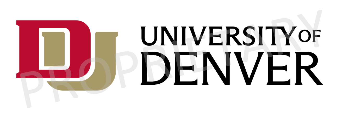
University of Denver officials unveiled a new logo this month after two years of working to refresh the school’s brand.
Two of the new logo designs are single-color black, while others feature the familiar crimson and gold colors.
The new designs were revealed at a campus town hall meeting May 12, then published to the DU administration community via email Tuesday.
“The University of Denver is excited to reveal a refreshed brand to the public this fall,” Renea Morris, vice chancellor of marketing and communications, said in a statement. “(It’s) intended to further unify and showcase the unique DU student experience offered at DU’s main campus and enhanced at DU’s new Kennedy Mountain Campus, the new brand will include a refined messaging platform, enhanced visual identity and revitalized logo.”
The university worked with Philadelphia-based marketing firm HeavyDoesIt, which has worked with Rutgers University, the University of Buffalo and the University of Wisconsin-Madison, according to its website. The university also worked with reputation strategy management firm Carnegie.
“While we have deep connections to our community, we face significant visibility and reputational challenges outside Denver and Colorado,” Morris wrote in an email to administrators.
Morris declined to provide specifics about those challenges when asked by The Denver Gazette.
The school hasn’t had a mascot since the “Denver Boone” cartoon figure — used from 1968 to 1998 — was jettisoned after being deemed by administrators as offensive to people of color and women. A committee declined to adopt another mascot in 2013.
“The refreshed brand was shared with the DU community this month, marking an important next step in a process that has been underway for two years and will continue in the months ahead,” Morris said in a statement.
The board of trustees approved the new logo in April.
“While our visual identity and brand is much more than our logo, our logo is a cornerstone of that identity,” Morris told administrators. “Positioning the University for success and supporting its reputation, recruitment and revenue goals is no small feat. However, we can unite DU with one brand, one logo and one message.
“The revitalized logo is an evolution of our current interlocking DU mark, a result that allows us to capitalize on the brand equity we’ve established while also resolving usability challenges we have experienced with some of our current marks. …. Our goal is to move the University forward by rising in the rankings, engaging new markets more meaningfully, building a robust student pipeline and creating an authentic narrative that resonates with all our audiences.”